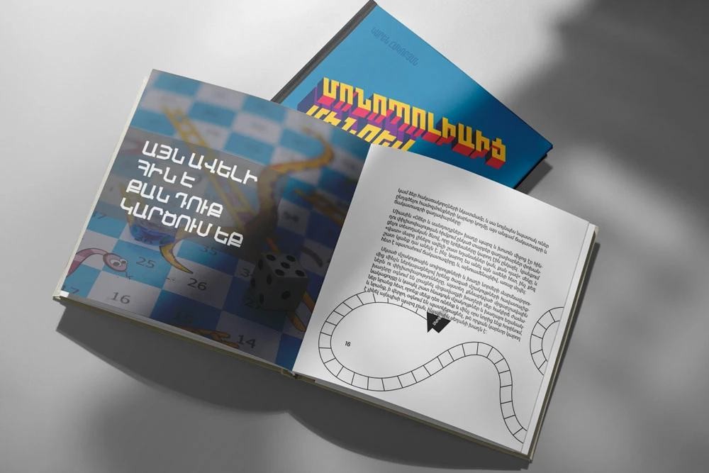
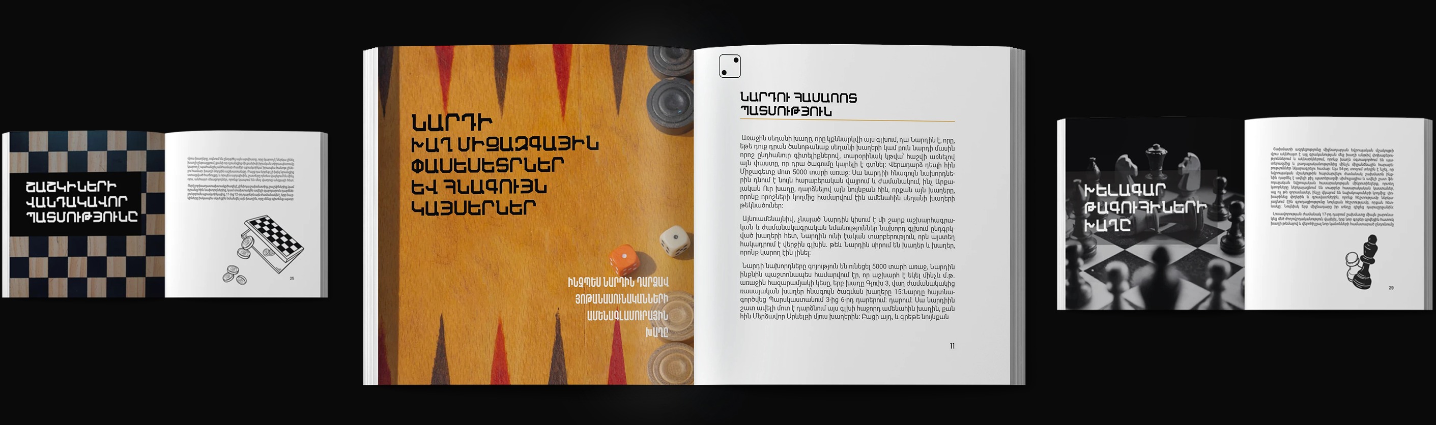
Armenian Typography Poster Design Series
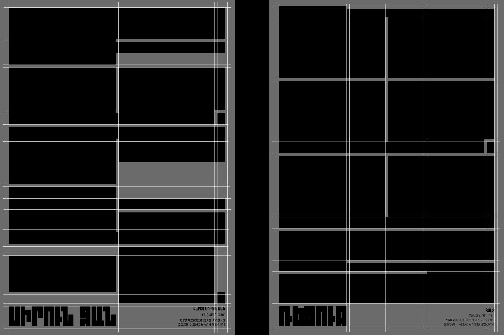
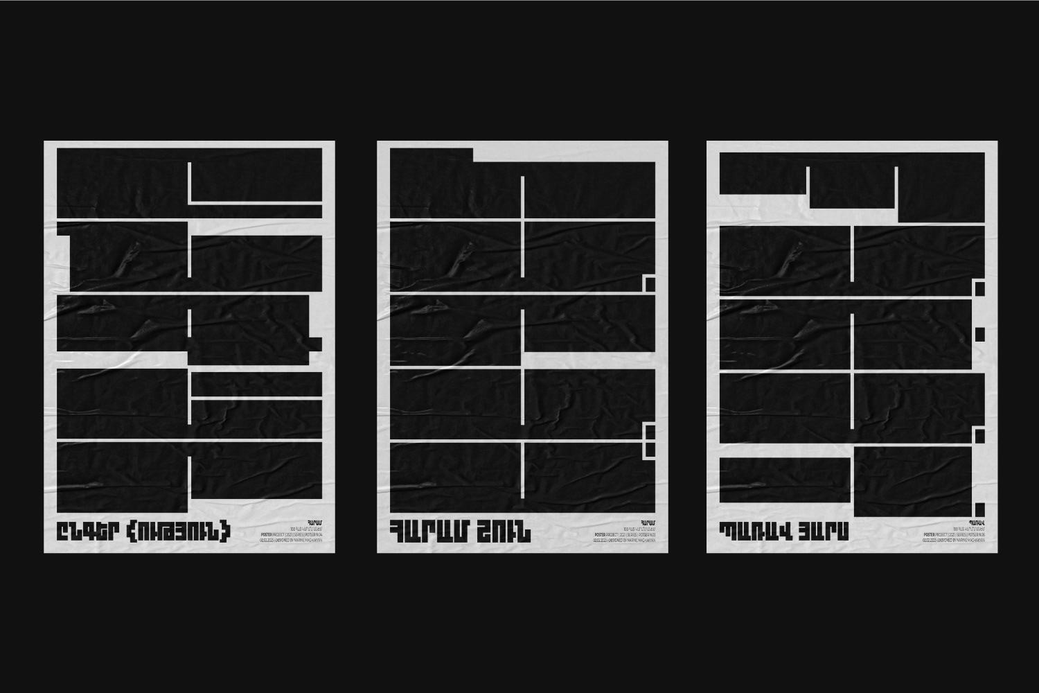
A phrasal poster series built entirely from the Armenian language and grid-based type — exploring how word, rhythm and structure alone can carry meaning, without imagery. Inspired to grow into a full collection of 100 phrases over time.
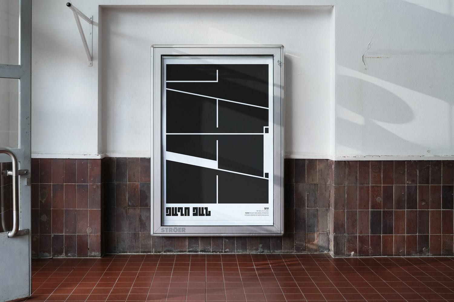
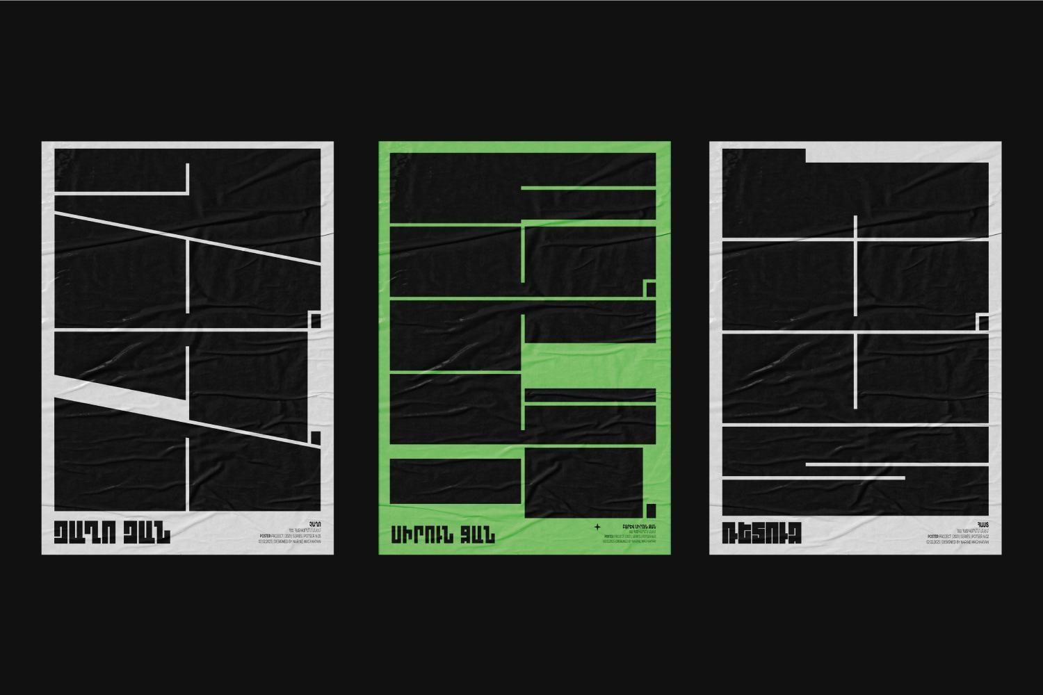
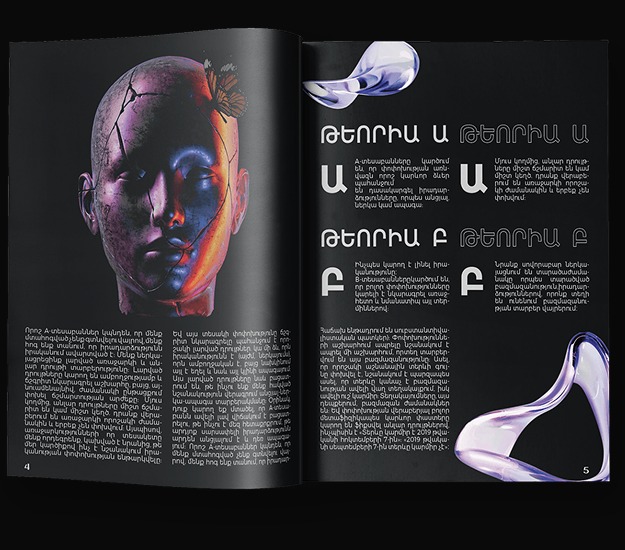
Editorial Layout Design — Book System
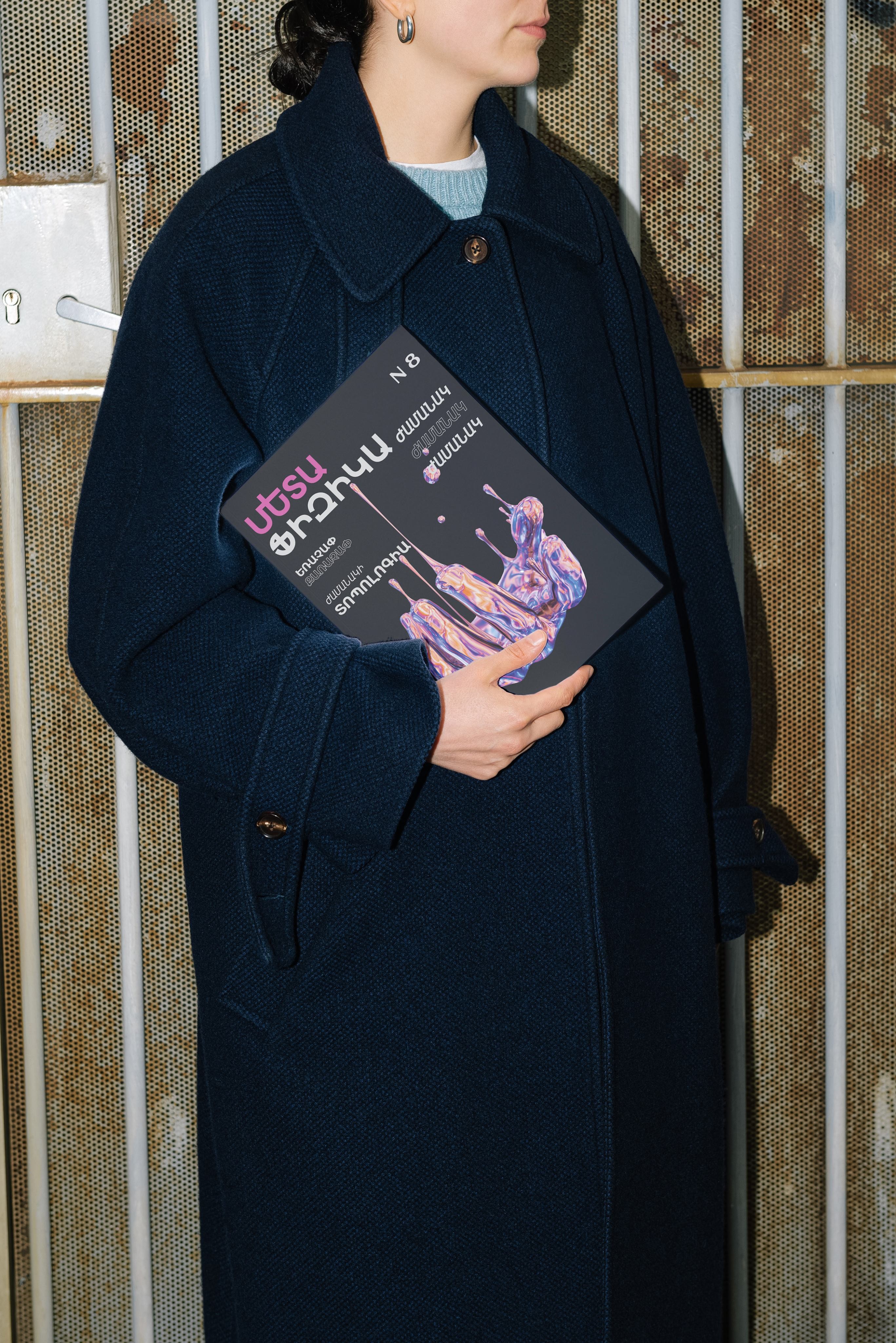
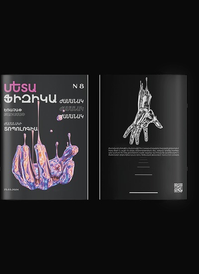
A layout-first approach to an independent editorial publication: a strict modular grid governs every spread, letting numbered sections, pull quotes and long-form text sit in clear, repeatable positions while abstract illustration is given room to breathe.
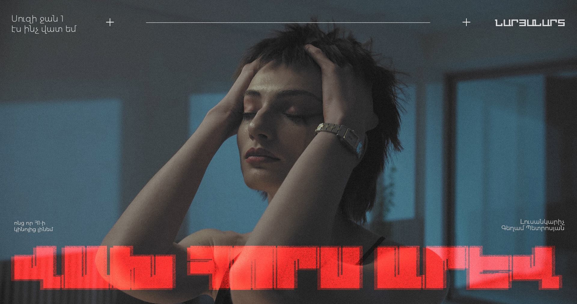
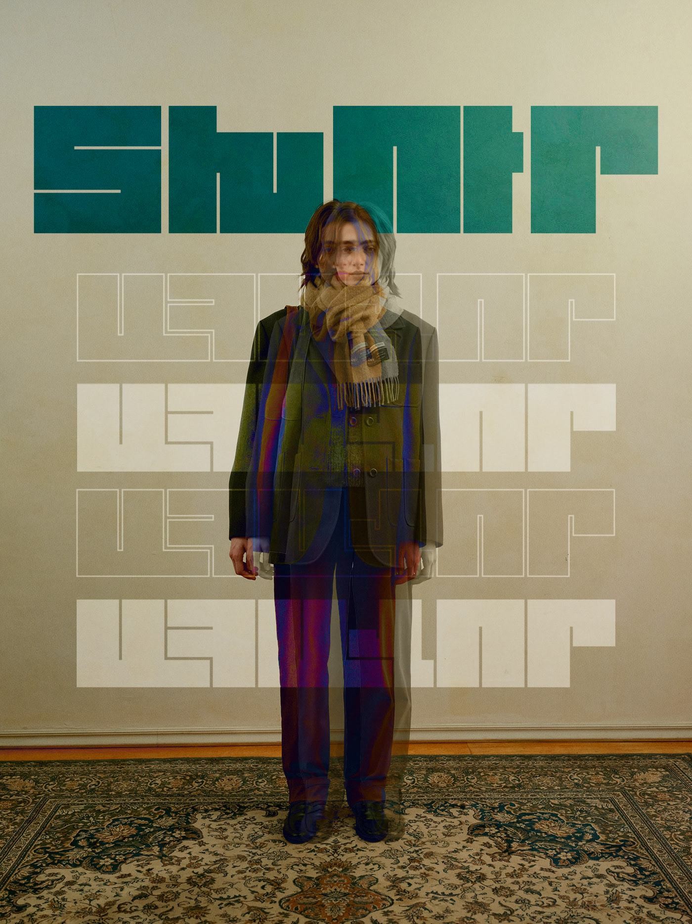
Experimental Poster Series
Portrait photography fused with distorted, glitch-driven Armenian type — exploring how language can fracture and reform across a single frame.
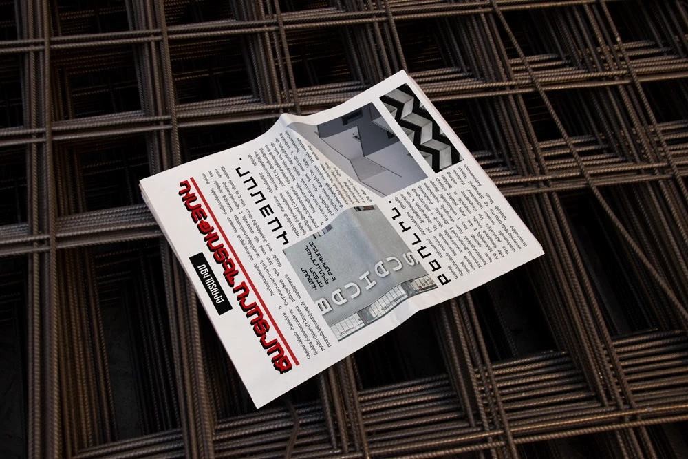
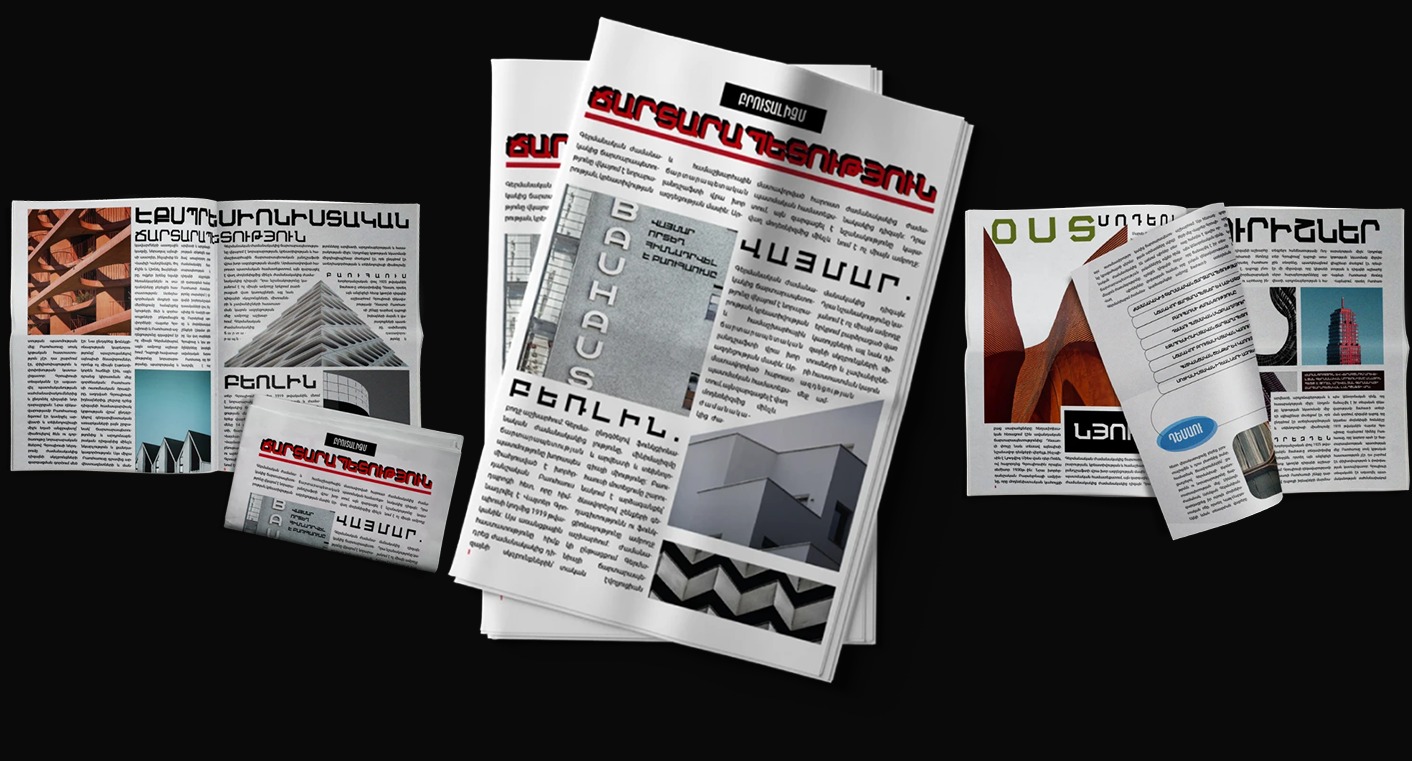
Newsletter Layout — Architecture Edition
A newspaper-format newsletter exploring architecture and structure, mocked up on-site against raw rebar and concrete to match its subject matter — Bauhaus references carried through a strict editorial grid.
Tetra-Armenia — Interactive Type System
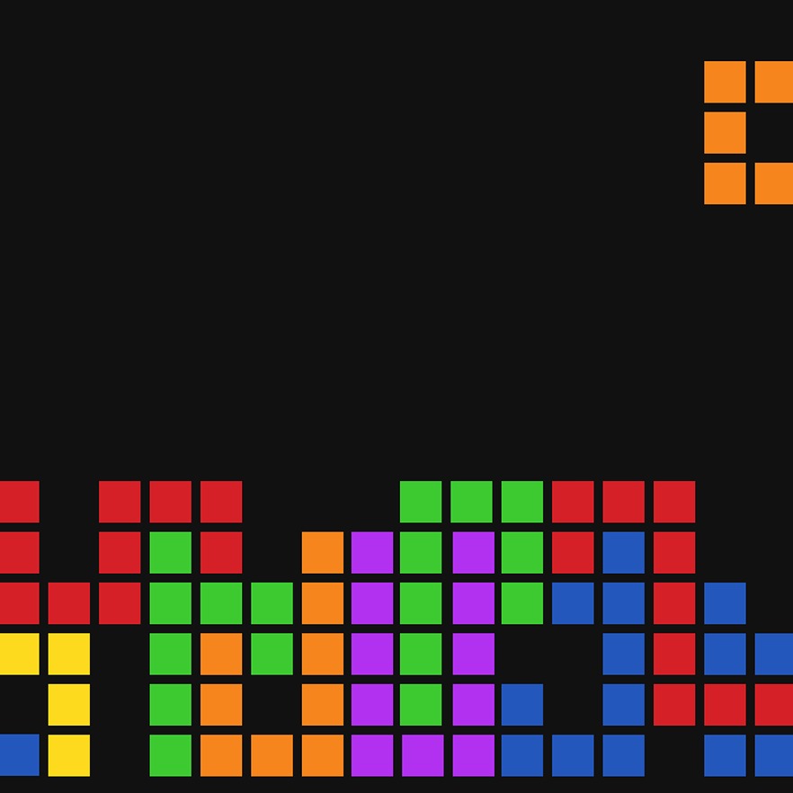
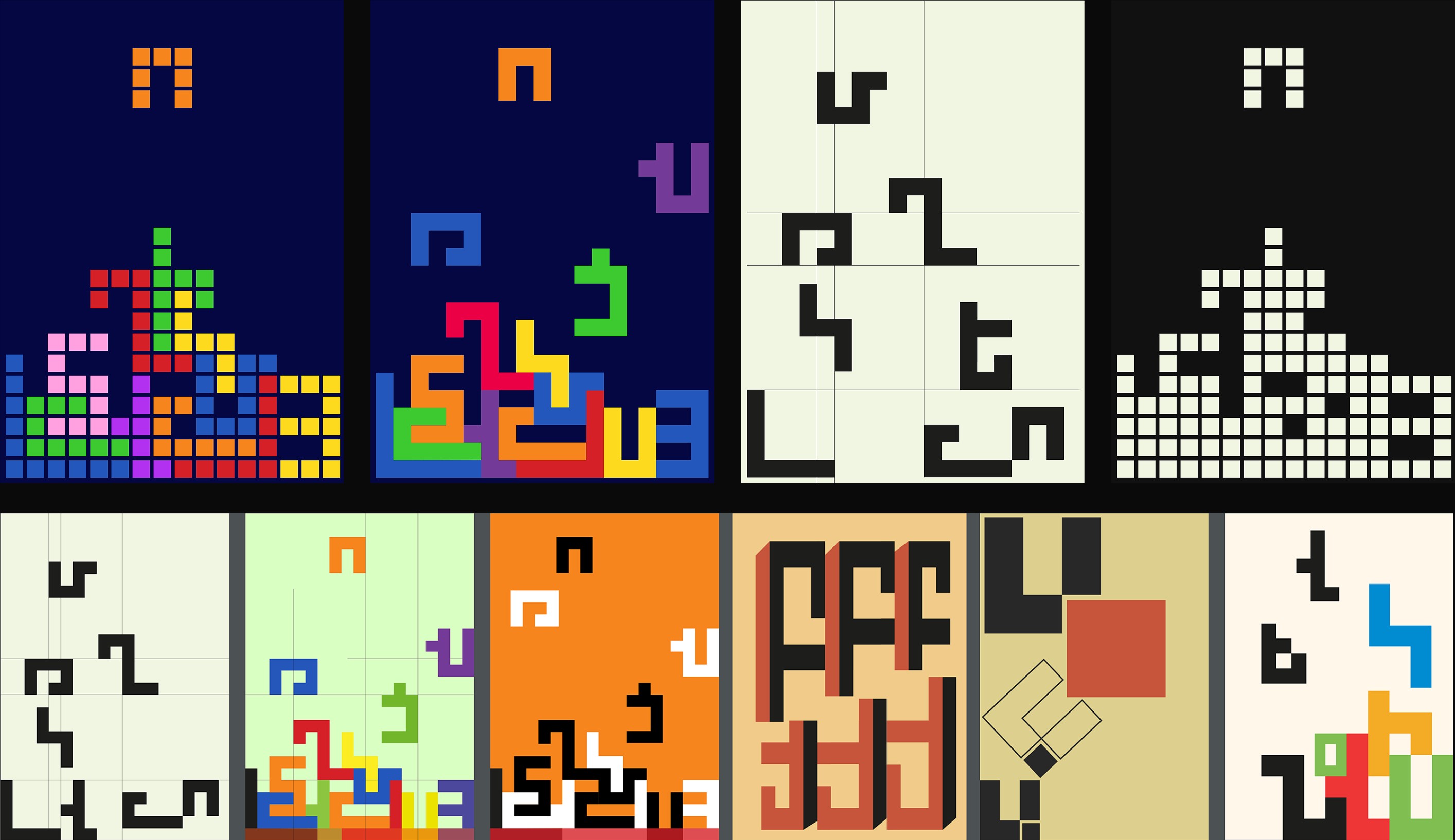
An experimental Armenian type design inspired by Tetris. Each letterform is built from interlocking cubes, resembling the falling blocks of the iconic game — combining the geometric allure of cubes with the artistic expression of Armenian letterforms into a playful, engaging typographic experience.
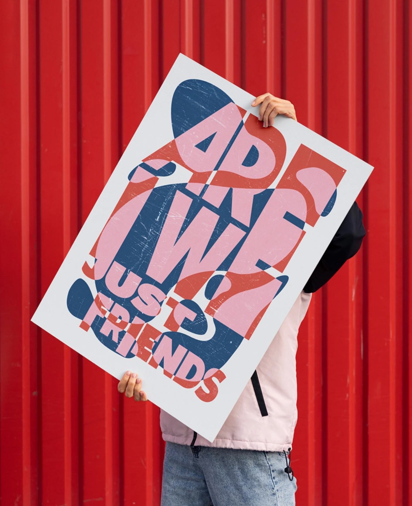
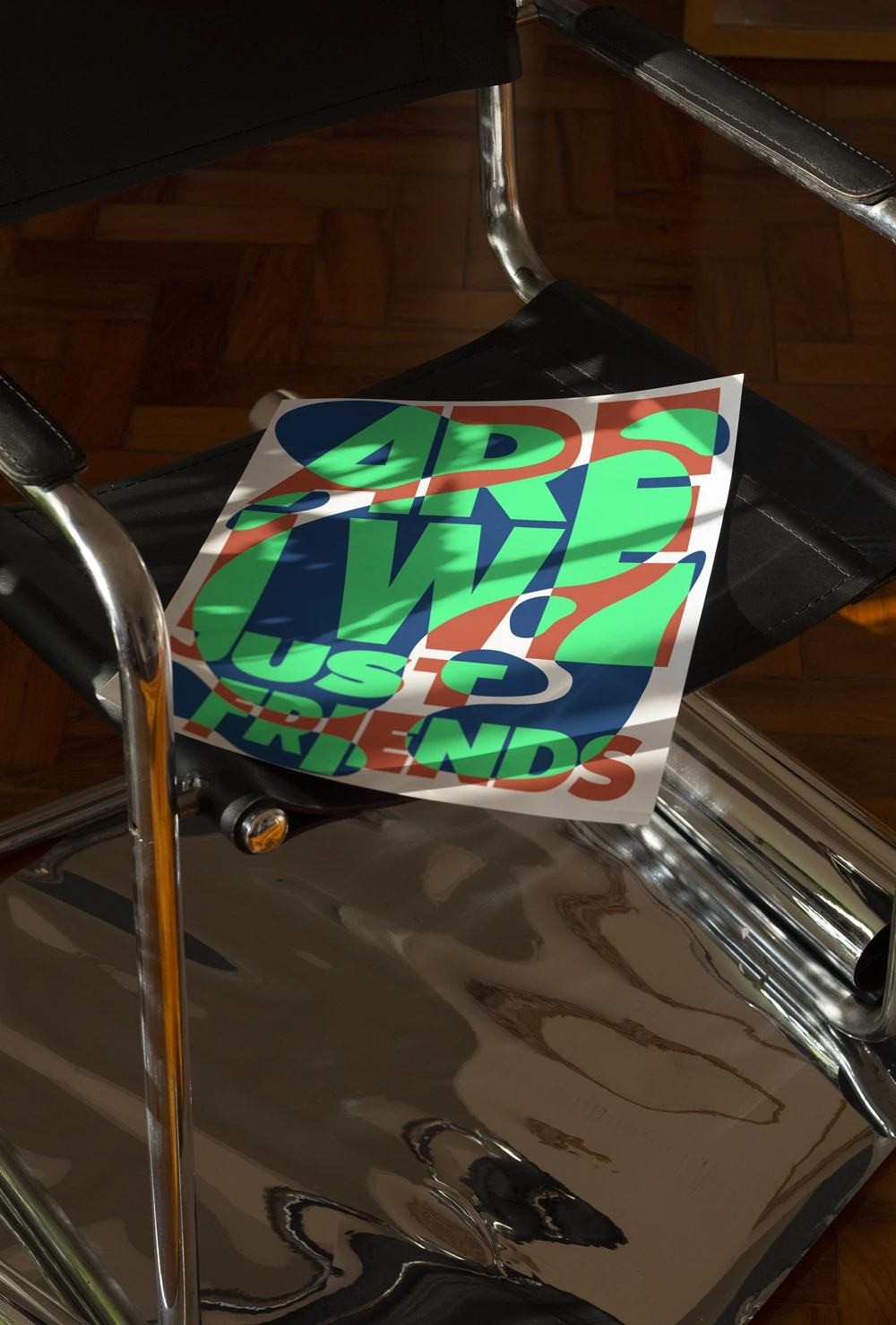
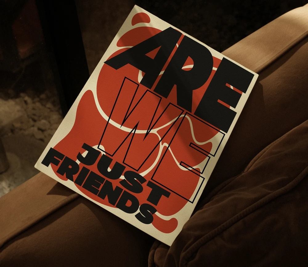
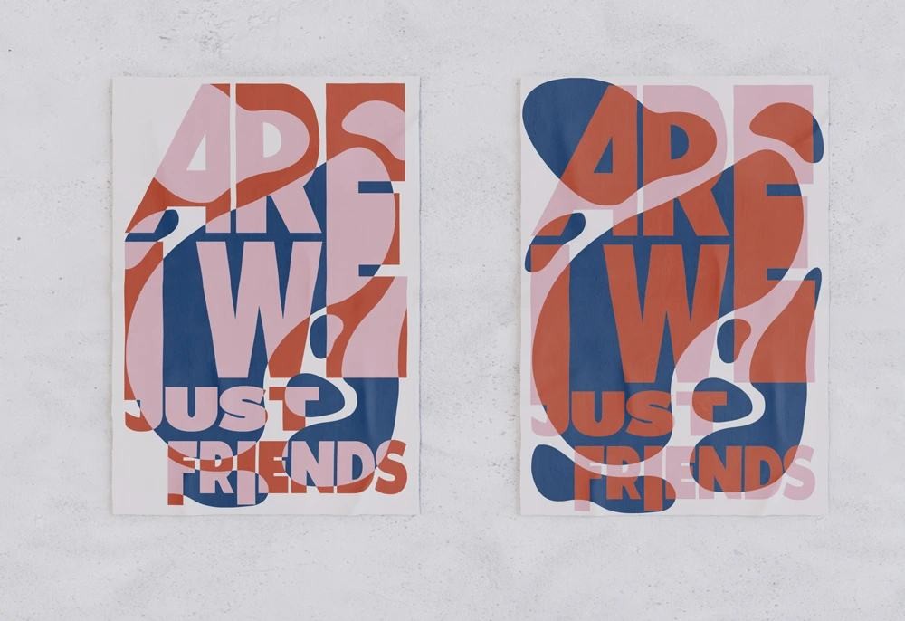
"Are We Just Friends" — Poster Variations
The same bold phrase, restyled across multiple colorways and surfaces — testing how one message reads differently depending on where and how it's shown.
Board Game — Layout & Packaging
Book and packaging design for an Armenian board game — checkered patterns, warm color blocking, and playful iconography carried through every page.