Vitality
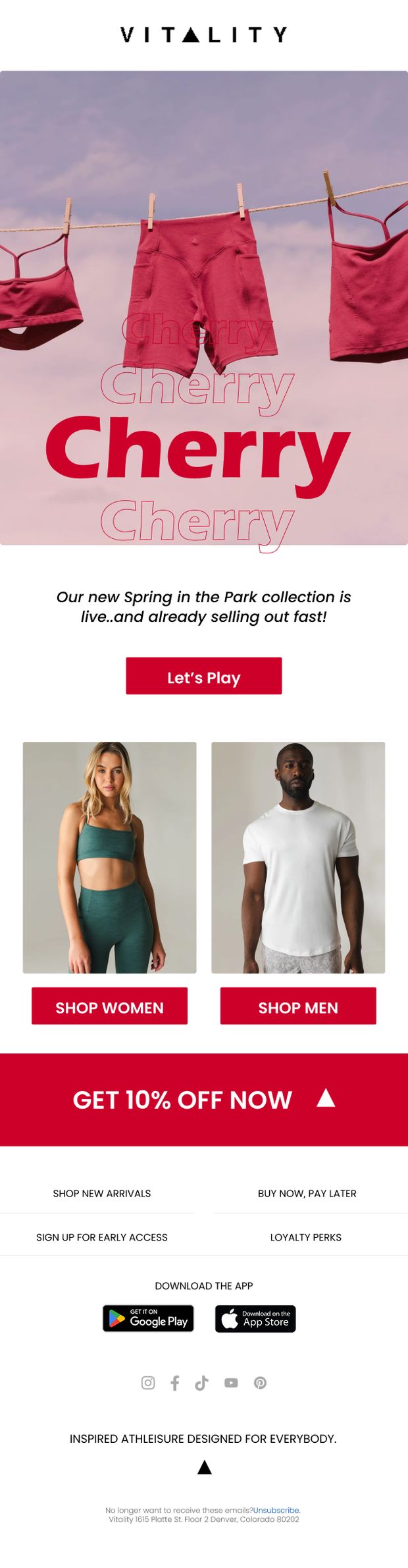
Athleisure — welcome flow, launches & drops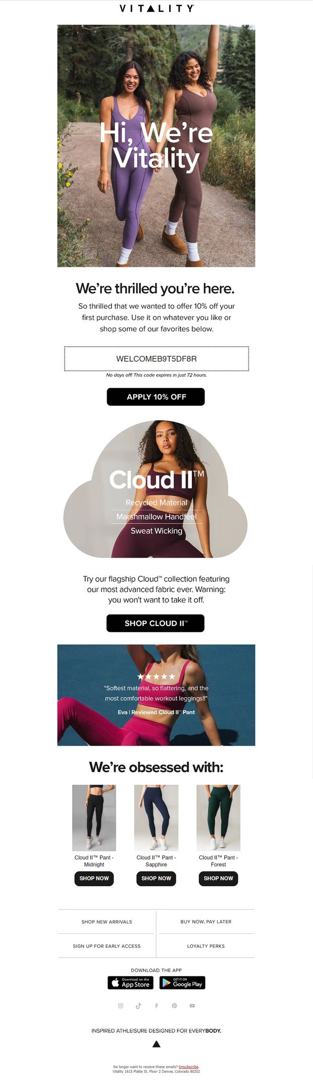 Hover to play
 Hover to play
 Hover to play
 Hover to play
Supergoop!
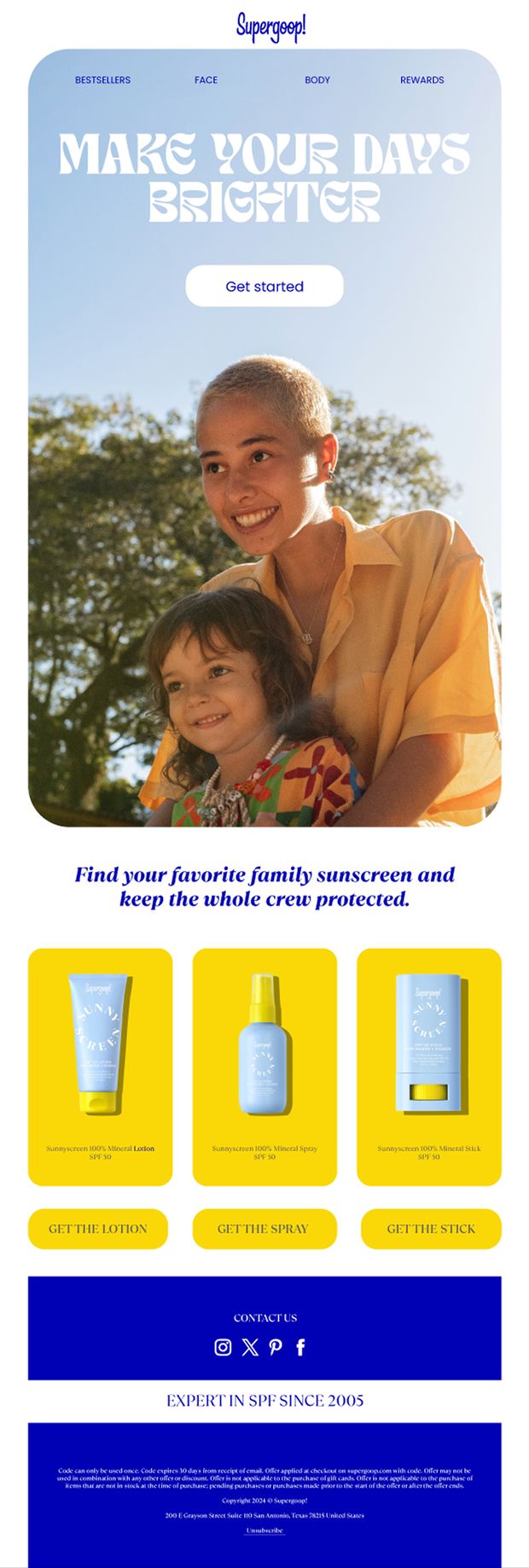
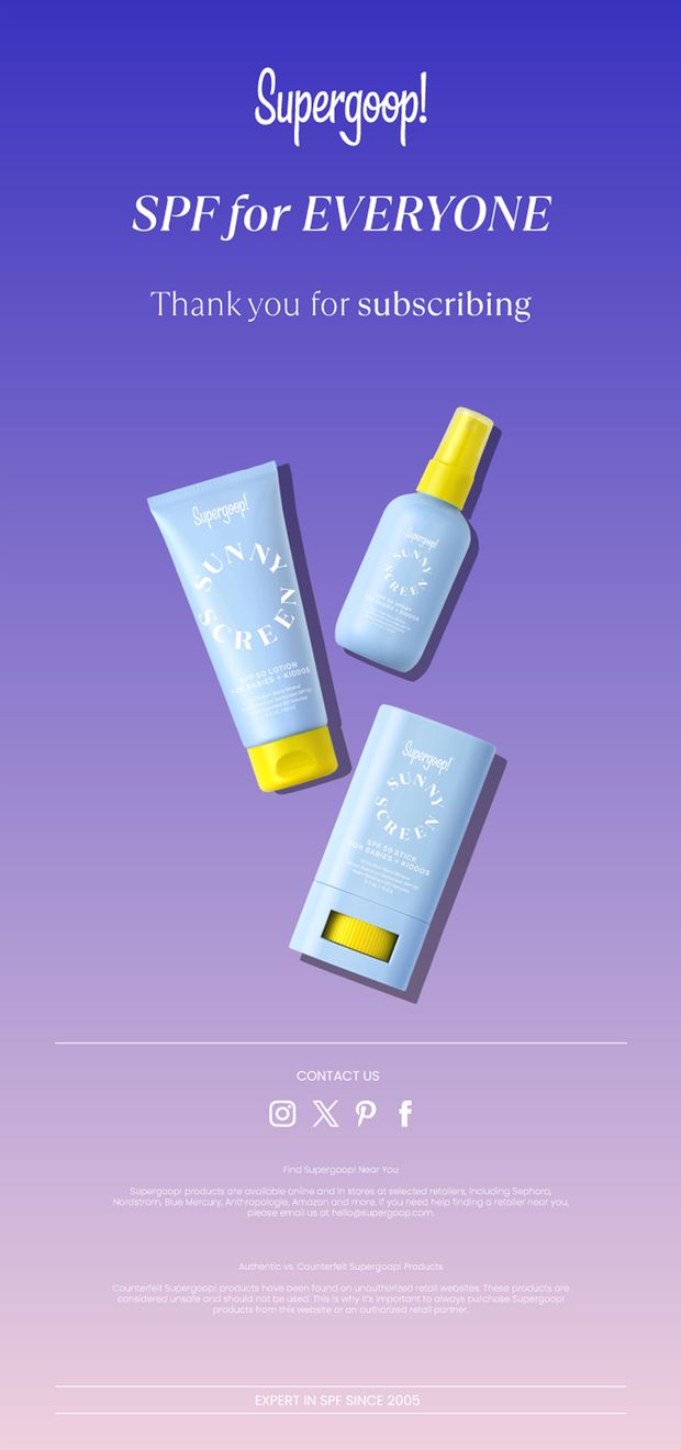
SPF skincare — onboarding & category campaigns Hover to play
 Hover to play
 Hover to play
Triangl / Casa del Mar
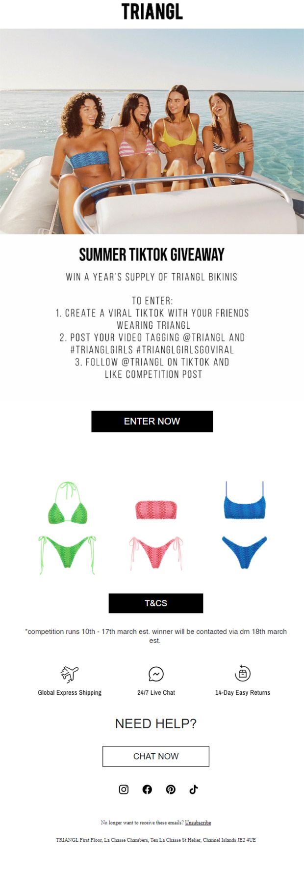
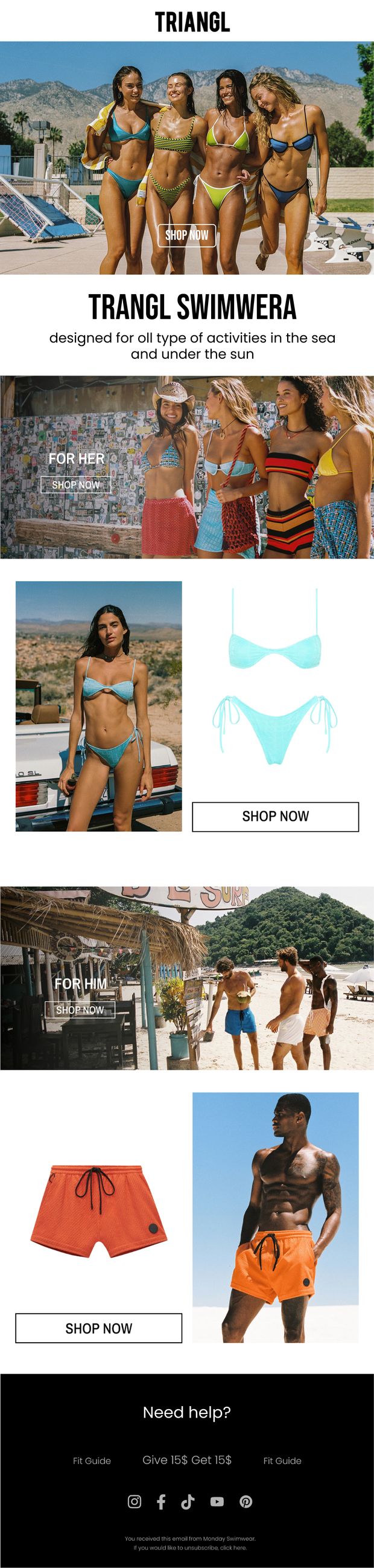
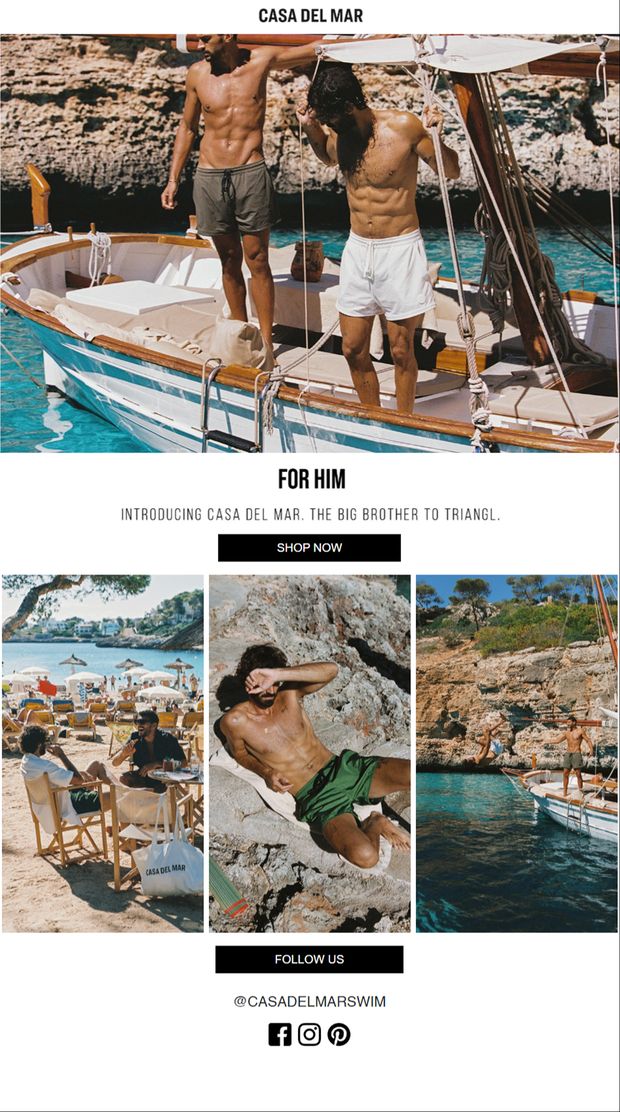
Swimwear — UGC activation, collection & brand launch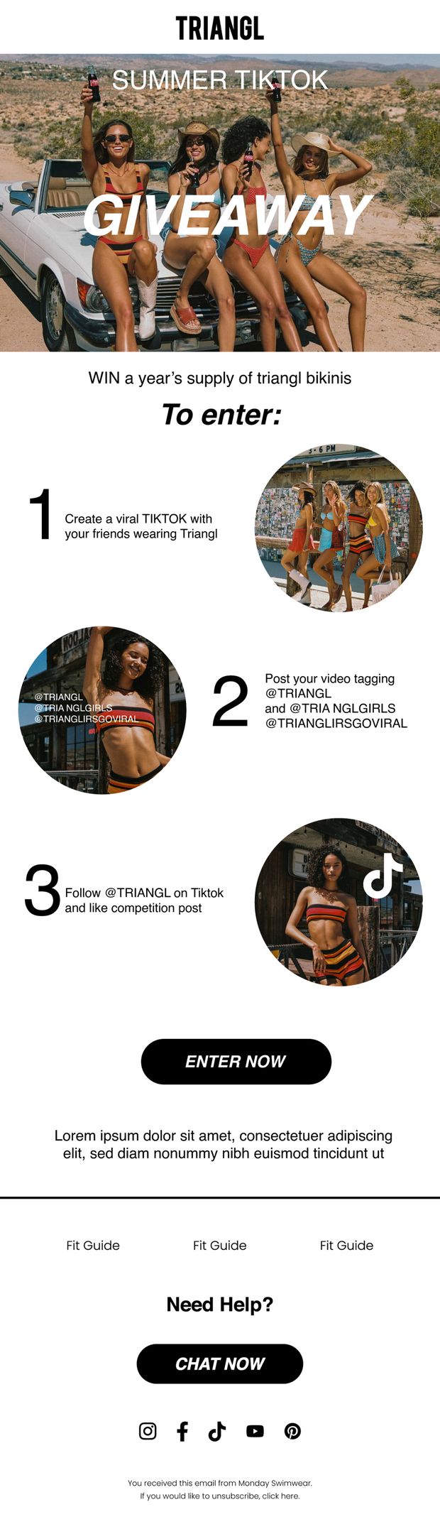 Hover to play
 Hover to play
 Hover to play
 Hover to play
Monday Swimwear
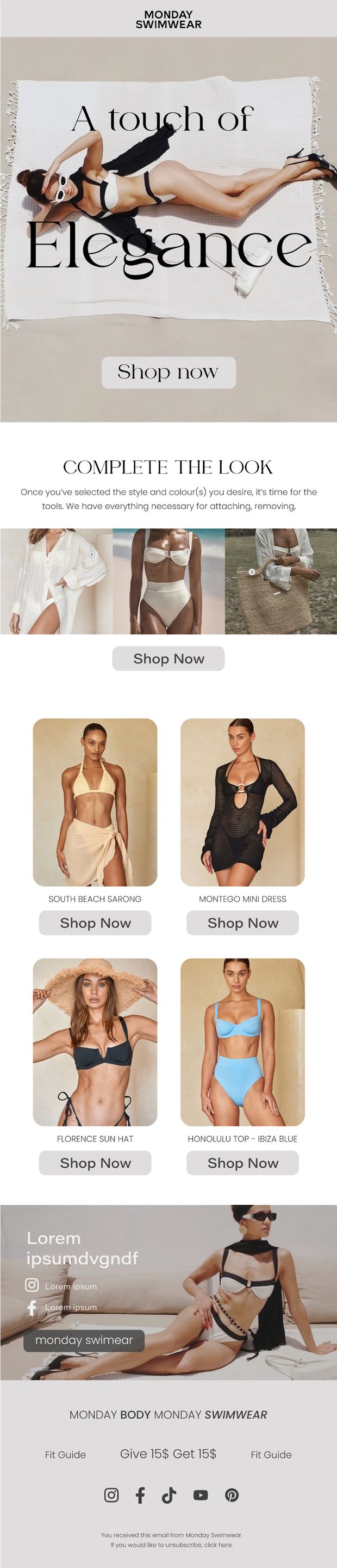
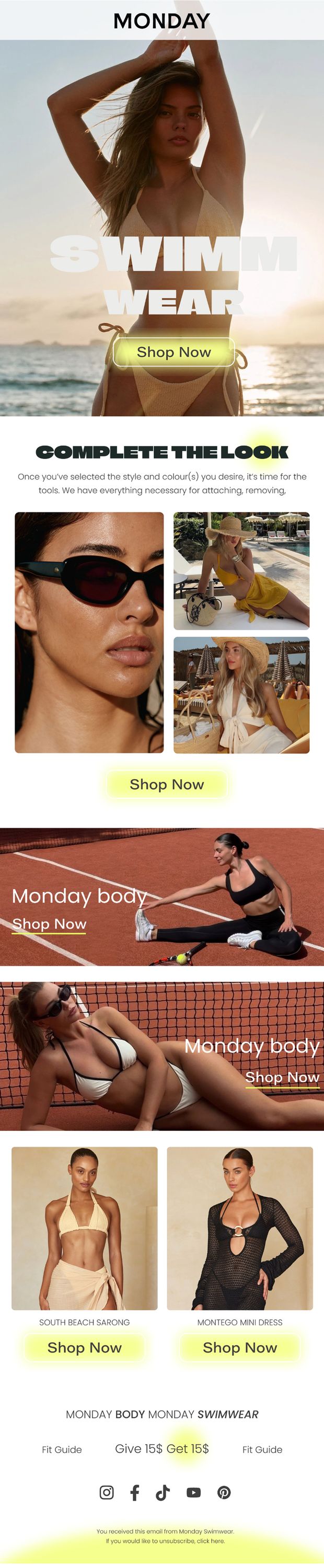
Swimwear — campaigns, drops & styling Hover to play
 Hover to play
 Hover to play
 Hover to play
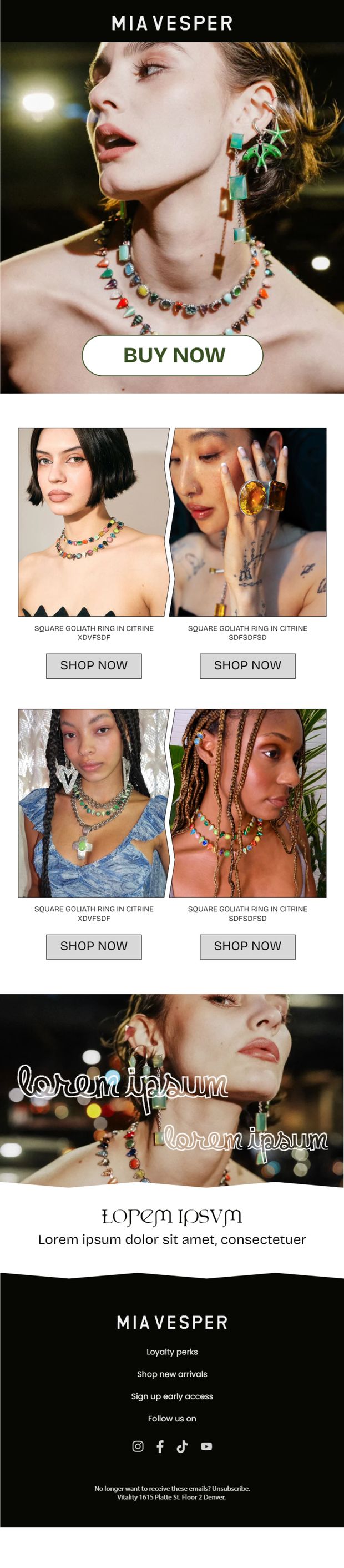
Mia Vesper
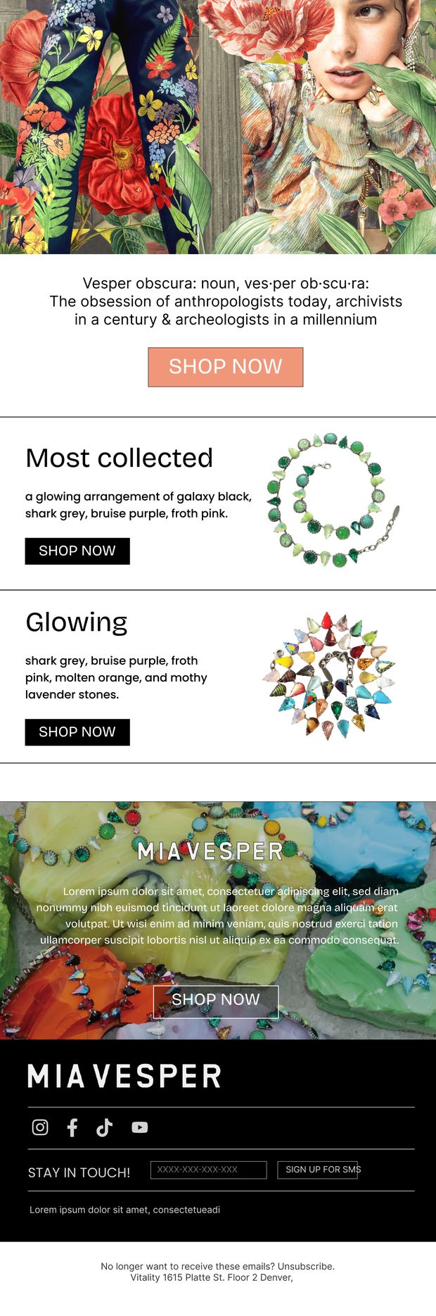
Fashion — seasonal edits & lookbook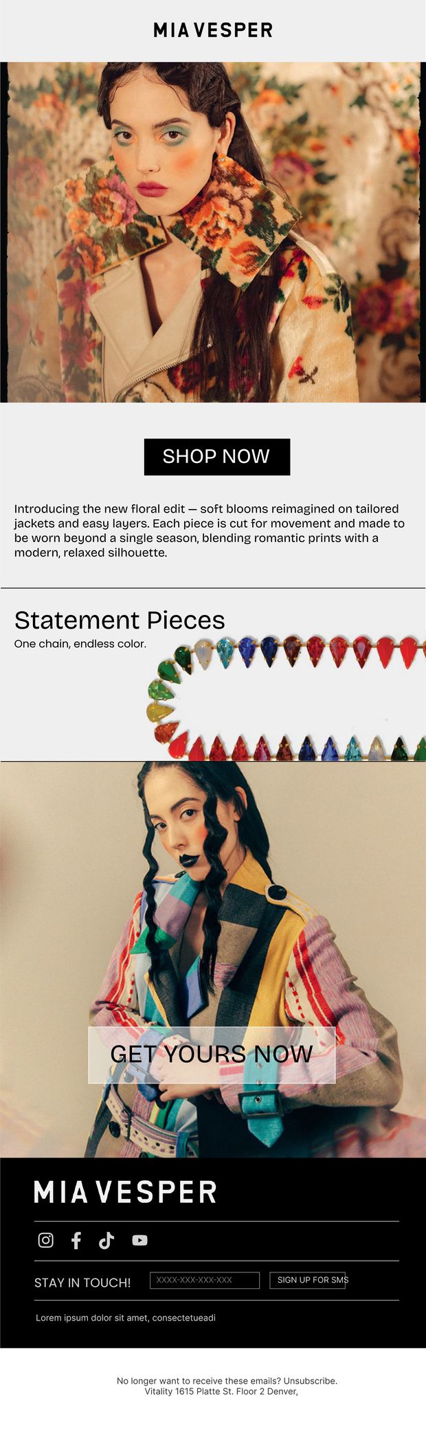 Hover to play
 Hover to play
 Hover to play
 Hover to play
Buffbunny
Activewear — promotion & product education Hover to play
 Hover to play
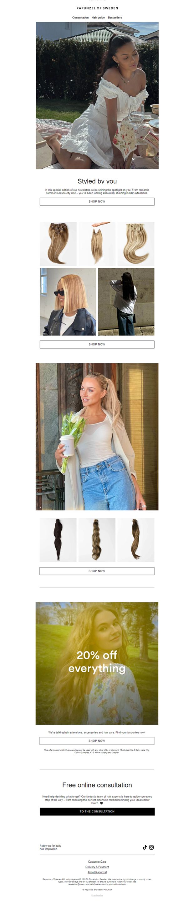
Rapunzel of Sweden
Haircare & extensions — promotions, routine & UGC Hover to play
 Hover to play
 Hover to play
 Hover to play
How they're built
Welcome flows
The first email a subscriber ever sees, carrying the code that converts them. Brand voice set immediately, one clear offer, and the hero product introduced before the reader has to scroll.
Promotional campaigns
Sitewide offers where the discount has to read instantly at thumbnail size in a crowded inbox — large type, product-forward imagery, and the button placed where the thumb already is.
Product education
Ingredient and fabric breakdowns that explain why a product works — annotated callouts, numbered routine steps and benefit labelling that turn a spec sheet into something worth reading.
UGC & community
Giveaways built around numbered entry steps so the mechanics are understood at a glance, with layouts that hold user-generated photography without looking like a different brand.
Modular merchandising
Product grids that scale from three items to thirty without redesign — consistent card spacing, price and title hierarchy, and per-product CTAs that survive reflowing to a single column.
Built for real inboxes
Every layout collapses cleanly to one column on mobile, stays readable when images are blocked, and keeps type at a size that works on a phone held at arm's length.