Feeds rather than one-off graphics — a creator-recruitment campaign, an editorial post series carrying market commentary, weekly blog hero art, and a lifecycle CRM system running over email, web pop-up and push. Each is a system built to be re-run every week without redesigning it.
ClientFreedx
Pieces35
LanguagesEN · ES · UA
ChannelsSocial · Blog · CRM
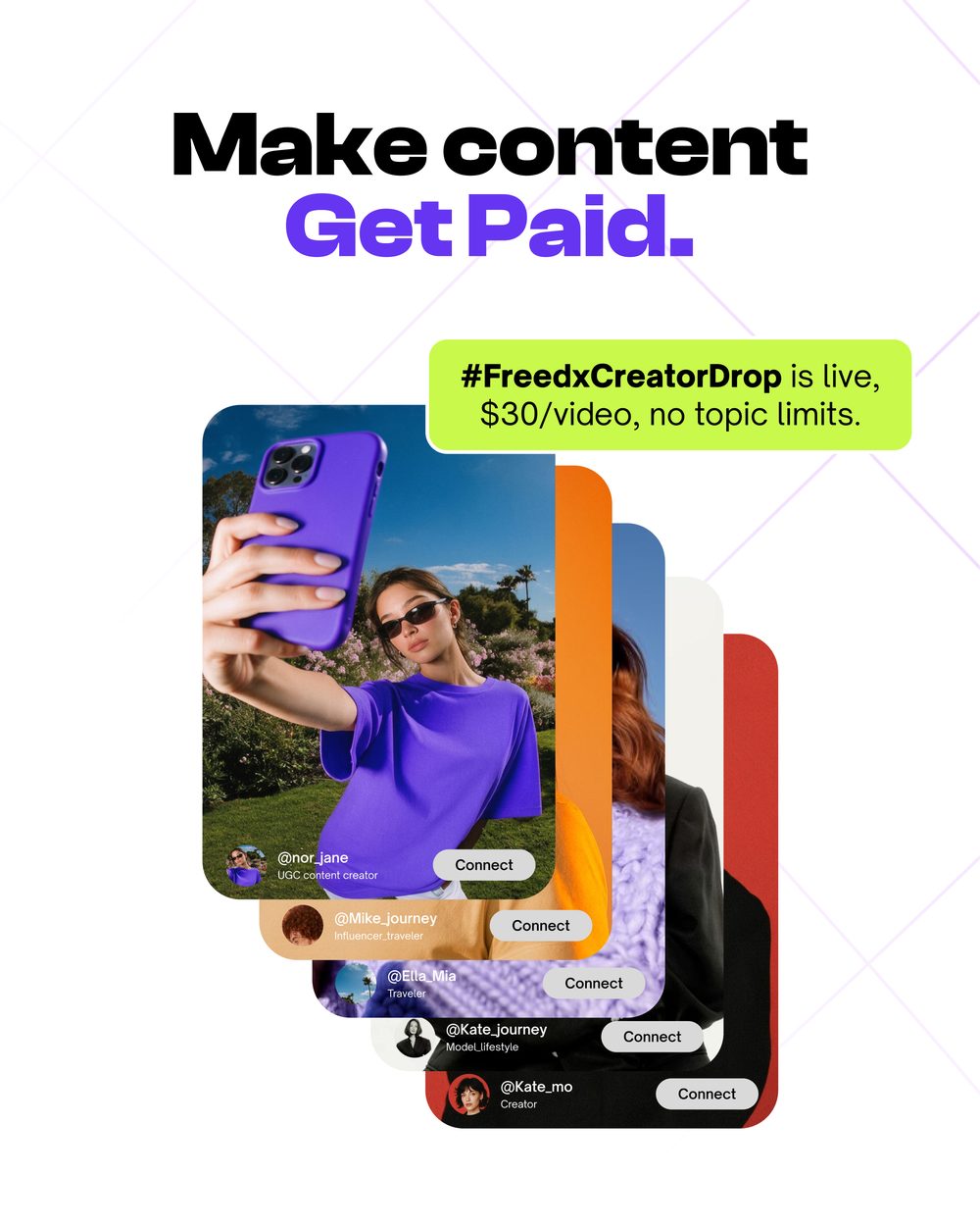
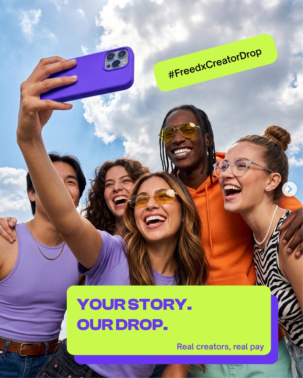
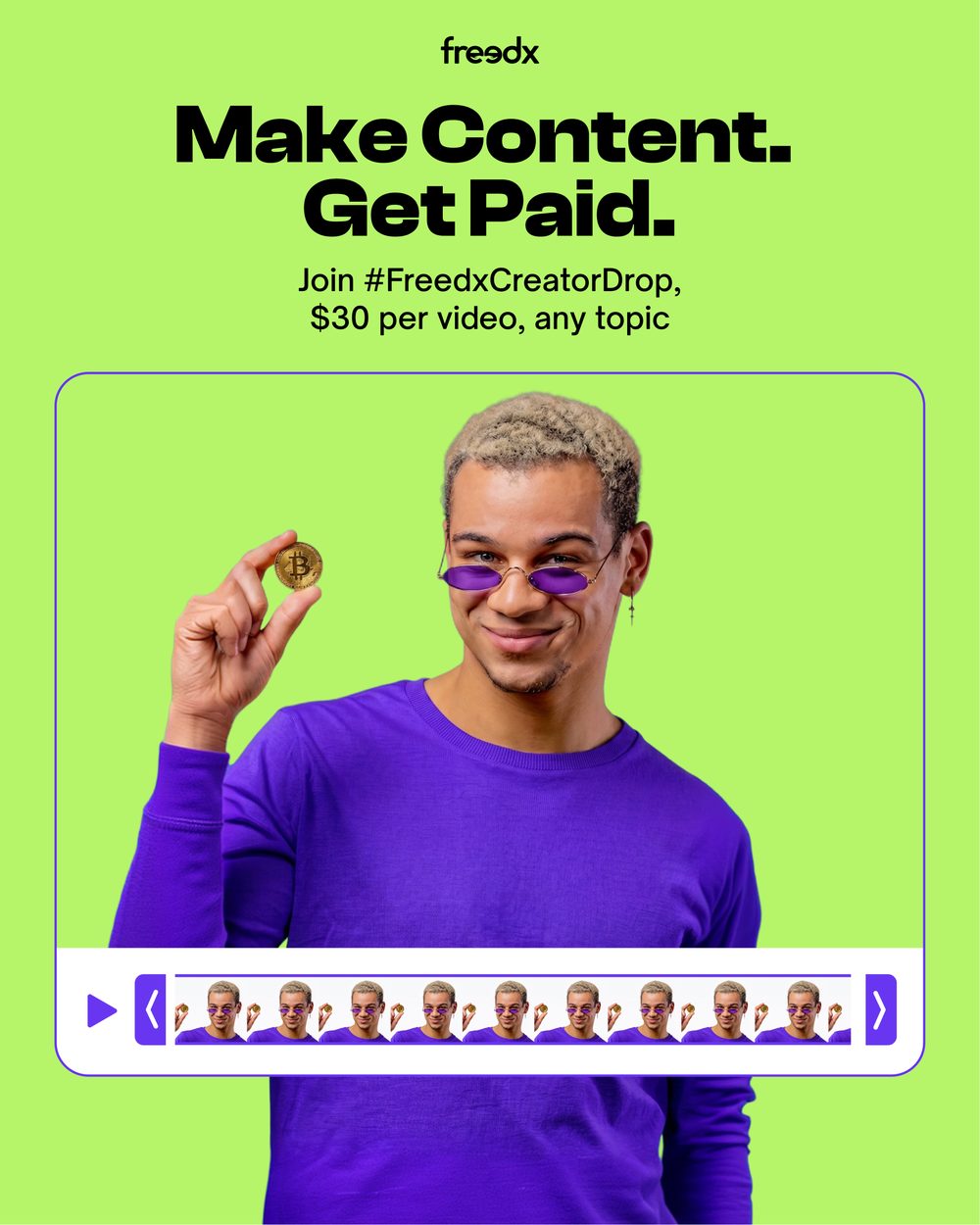
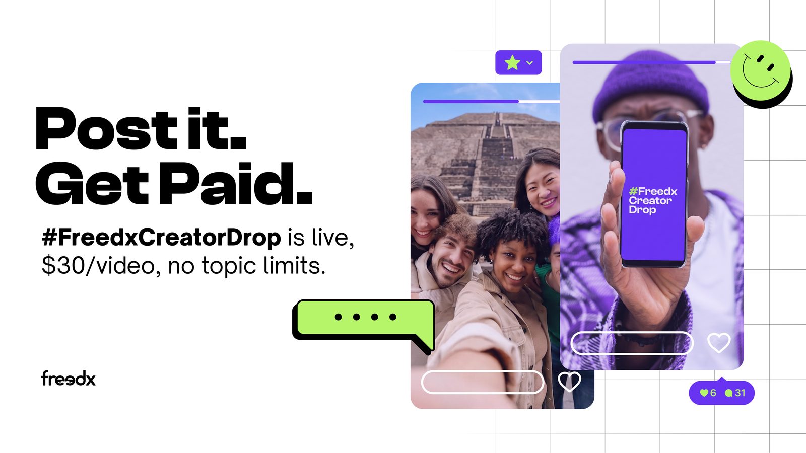
Freedx — Creator Drop
UGC campaign · 4:5 & 16:9
A creator-recruitment campaign built to look like the thing it's recruiting for: UI cards, chat bubbles and profile chips assembled around real creator photography, so the offer — $30 a video, any topic — reads as a platform feature rather than an ad.
Freedx — Editorial Social
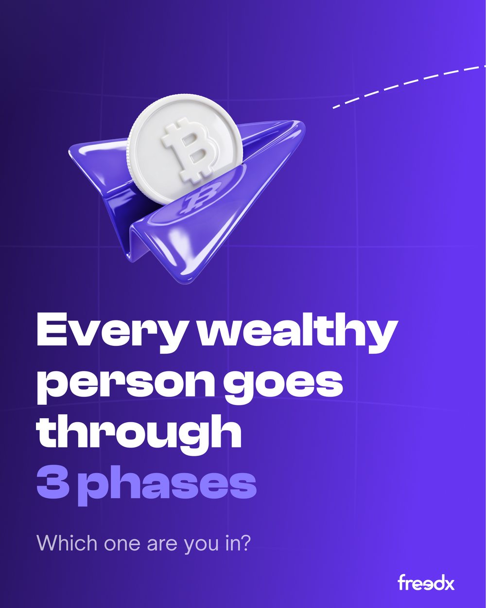
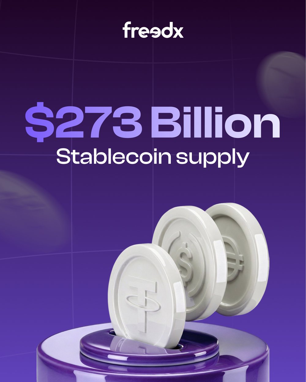
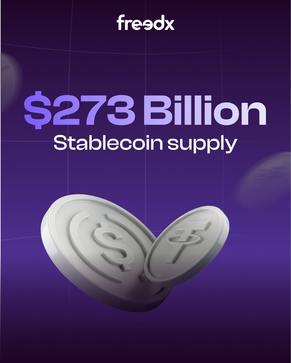
X posts & carousels · 4:5
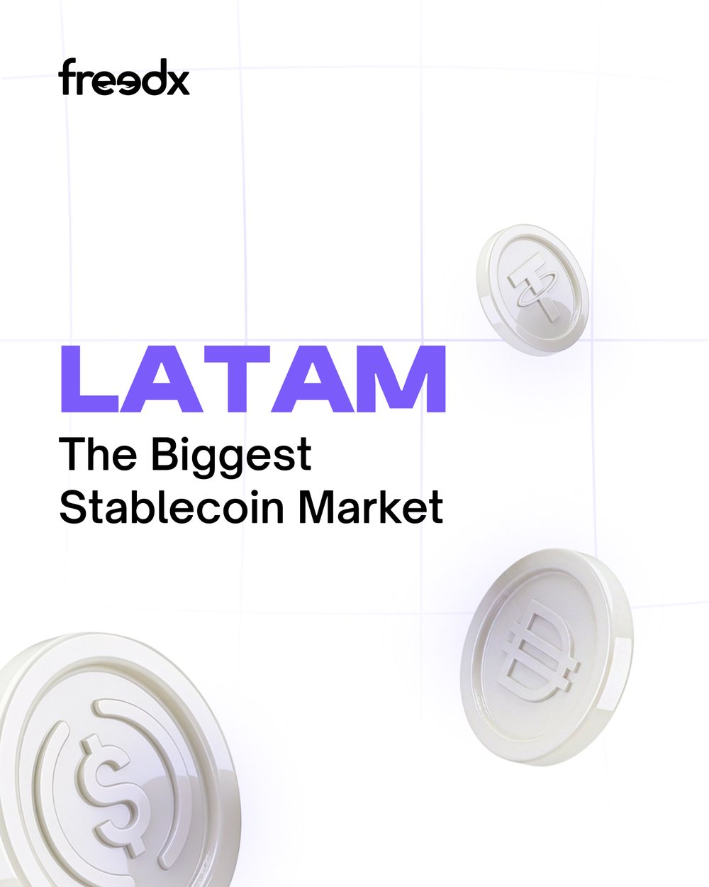
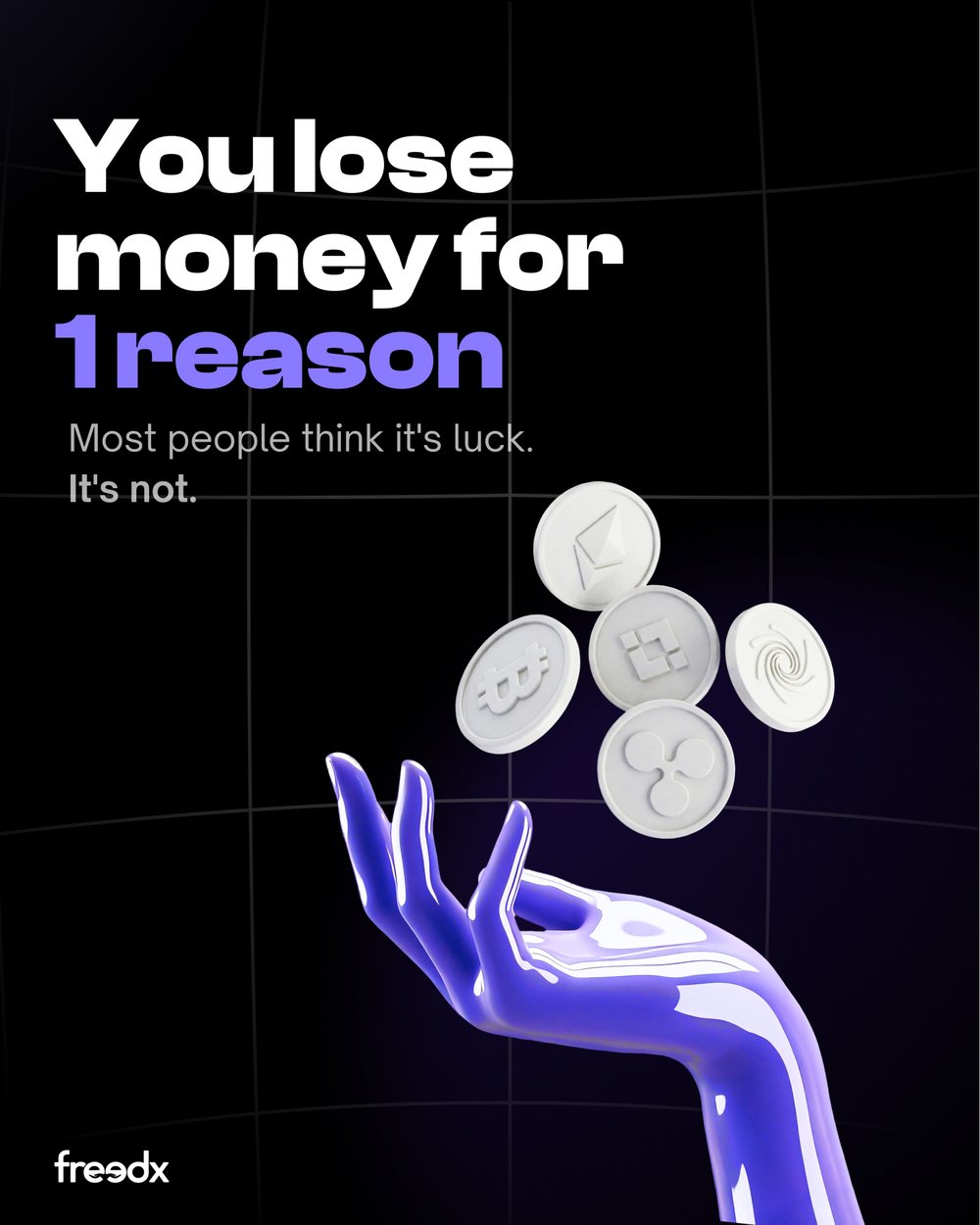
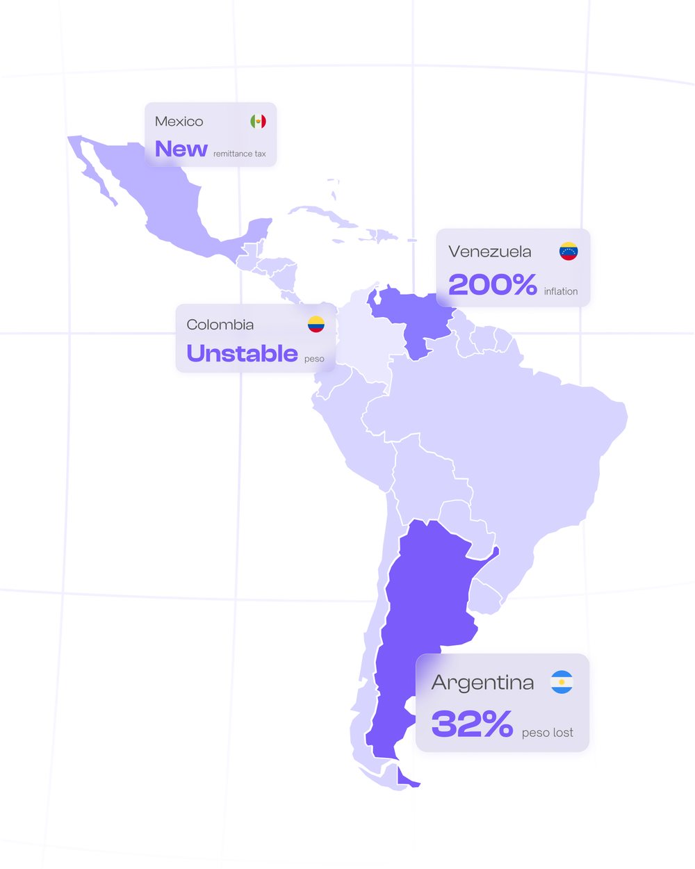
Market commentary and product news as a running series. Two palettes work as one system — deep purple for the brand's own moments, near-white for the data and research posts — with the same 3D coin language carrying across both so a feed of them still reads as one voice.
Freedx — Blog Banners
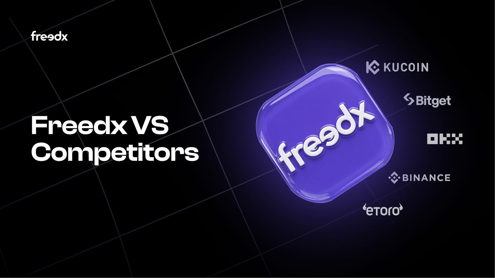
Weekly hero art · 16:9
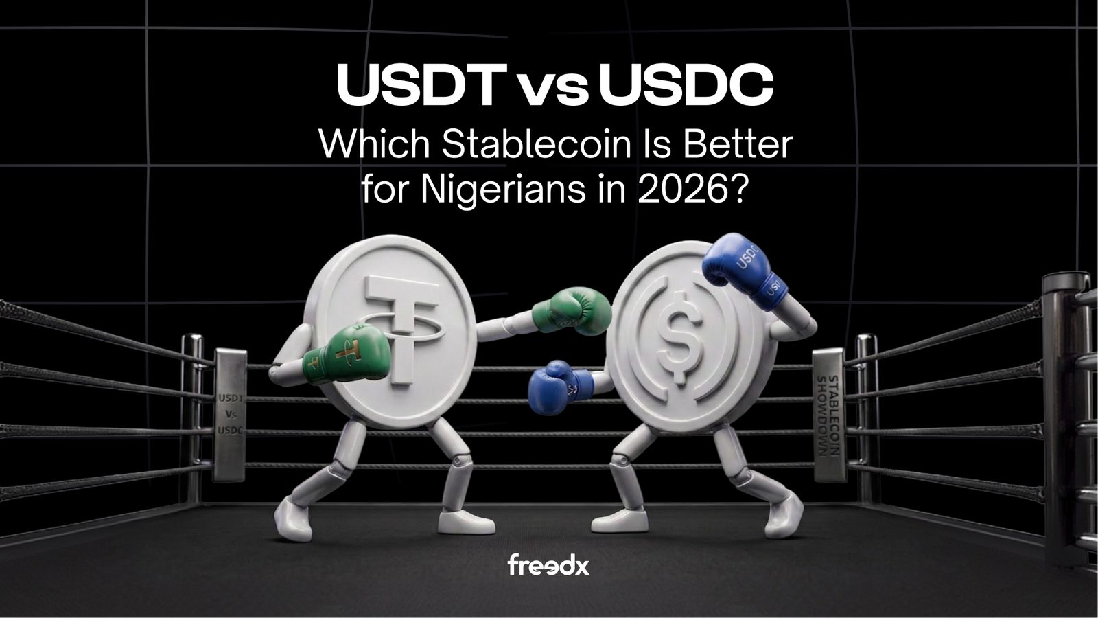
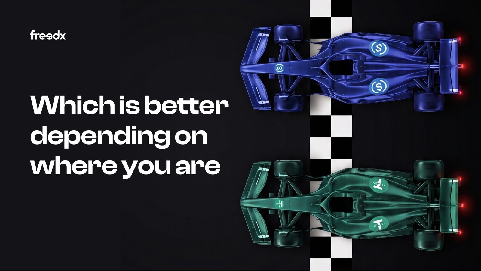
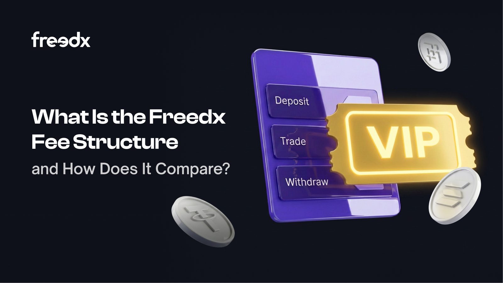
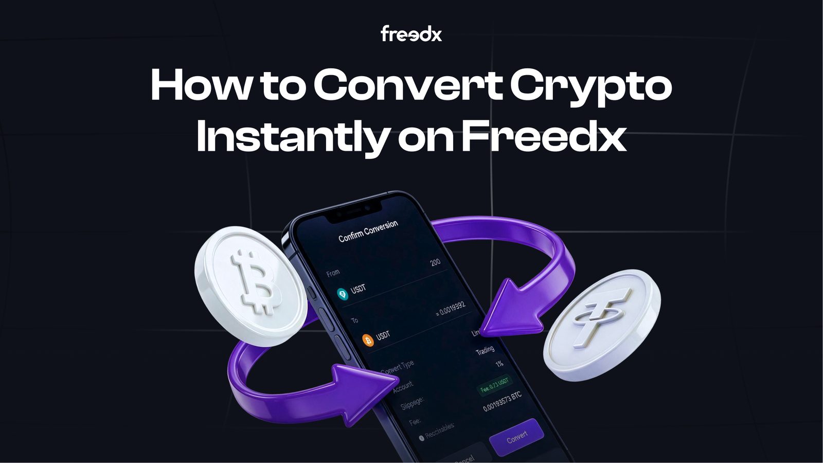
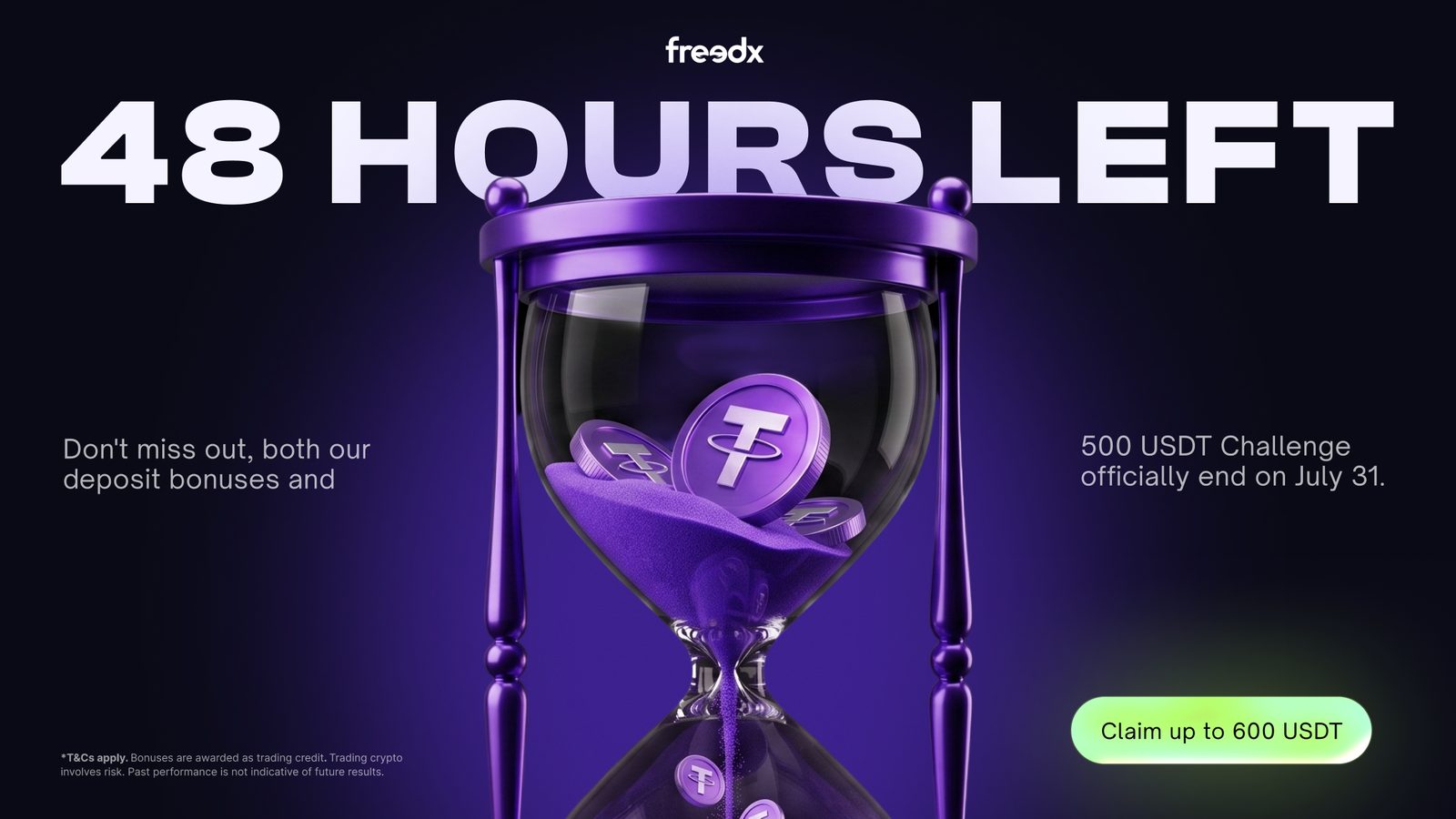
Hero art for the weekly blog. Each banner has to explain a comparison at thumbnail size, so the concept is staged as an object — two coins in a boxing ring, two liveries at a start line, a VIP ticket cutting through a fee stack — rather than a headline over a gradient.
Freedx — Lifecycle & CRM
Triggered email, web pop-up & push
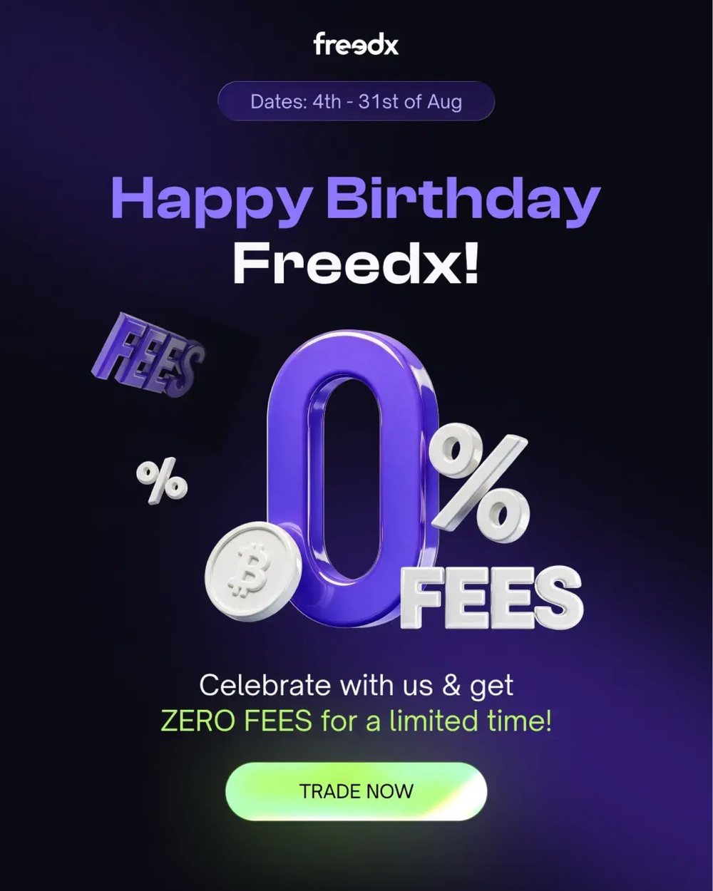
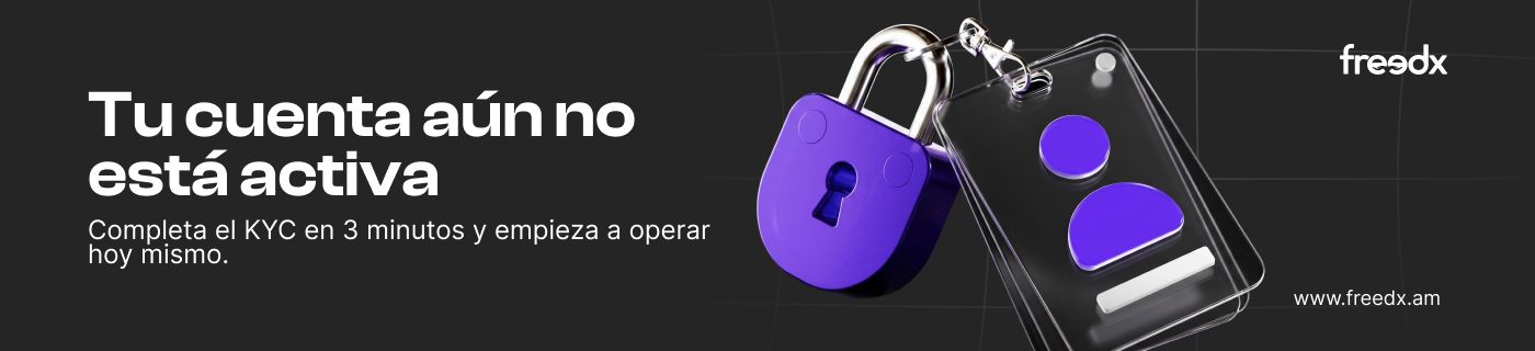
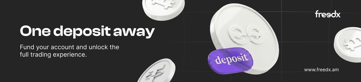
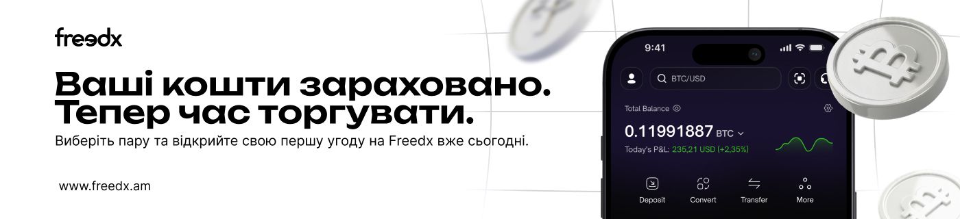
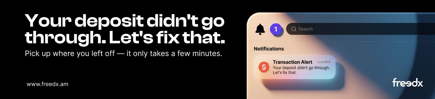
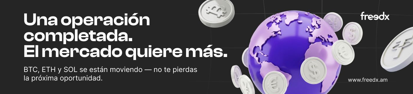
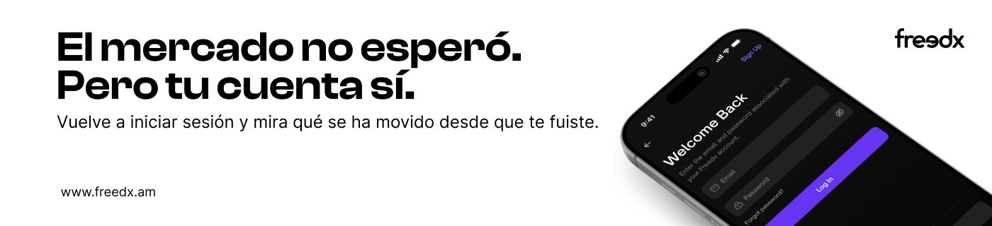
Behavioural triggers, each with its own job: get the account verified, get the first deposit in, recover a failed one, bring a dormant trader back. The 3D object carries the message so the same header works in three languages without redrawing the art.
Trigger headers Email · six states
Tu cuenta aún no está activaKYC incomplete · ES
One deposit awayNo first deposit · EN
Ваші кошти зарахованоFunds credited · UA
Your deposit didn't go throughFailed deposit · EN
Una operación completadaPost first trade · ES
El mercado no esperóWin-back · ES
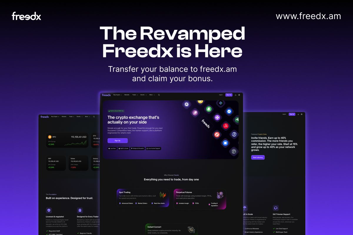
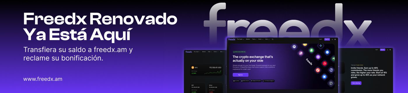
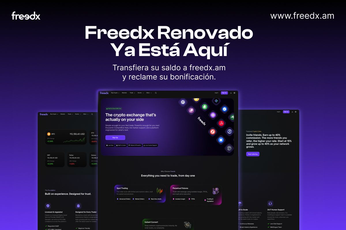
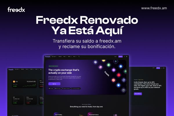
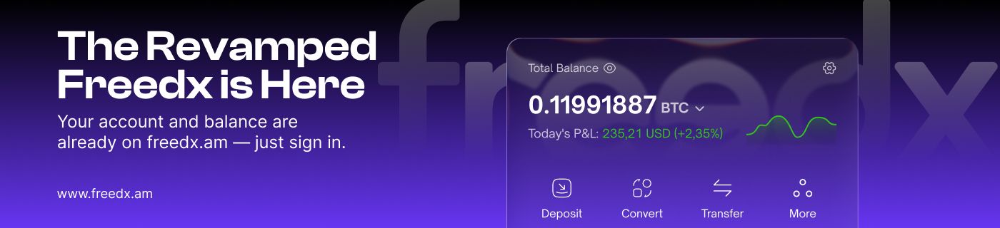
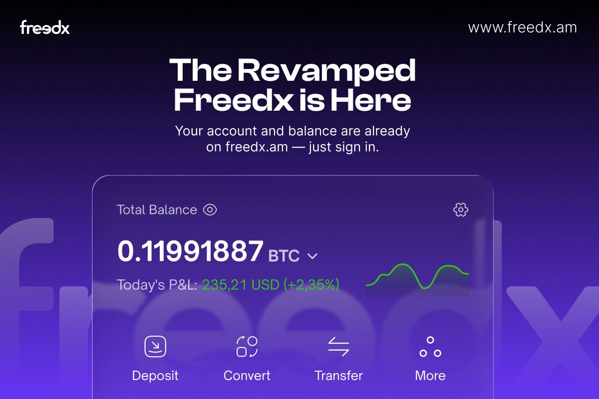
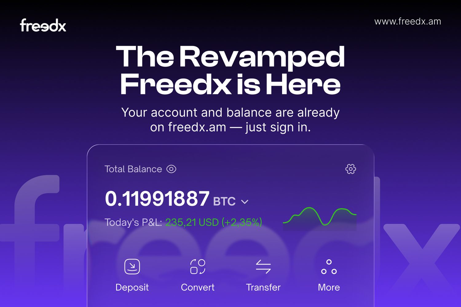
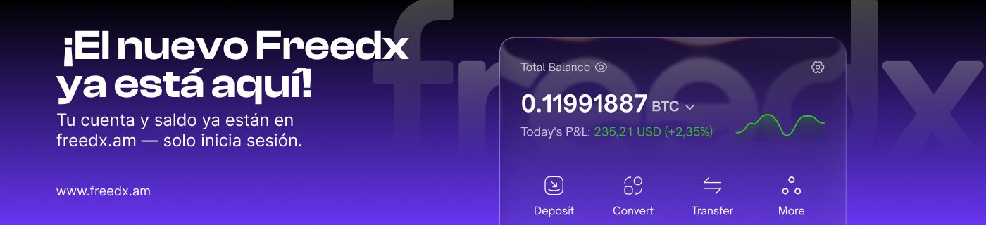
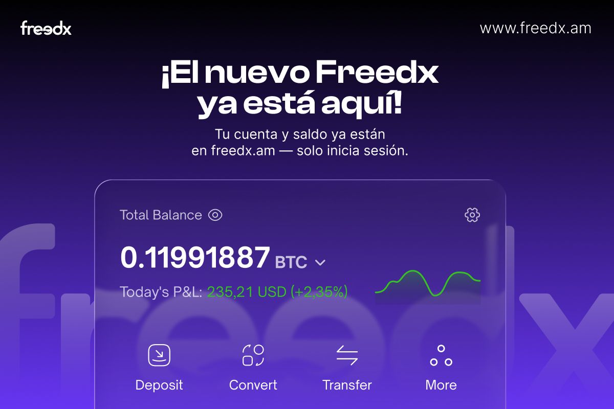
Platform migration One message, three channels
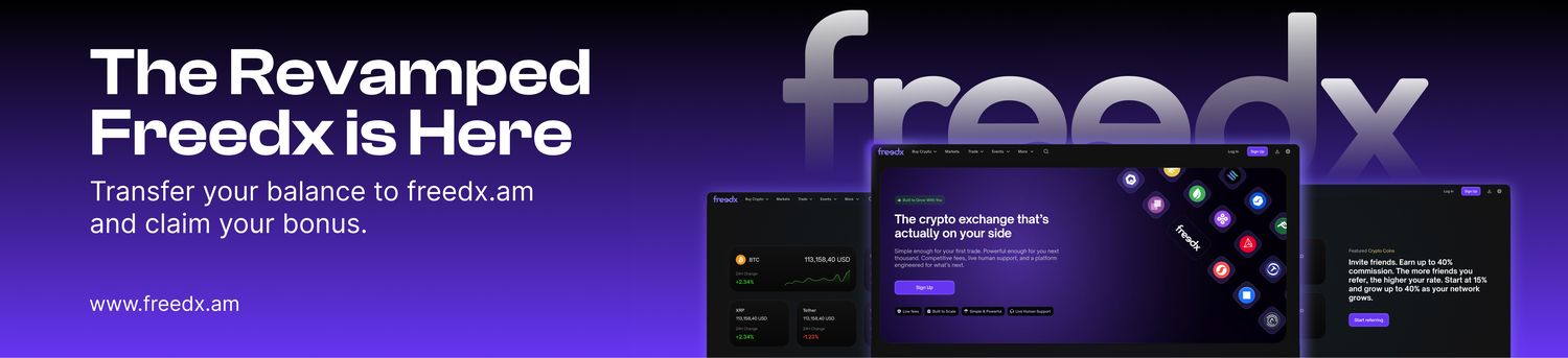
Moving an existing user base to a new domain — the same instruction rebuilt for an email header, a web pop-up and a push notification, then localized. Stage one asks for the balance transfer; stage two tells returning users their balance is already there.
Stage 01 Transfer your balance · EN
Stage 01 Spanish
Stage 02 Just sign in · EN
Stage 02 Spanish
How these are built
[ 01 ]
Template, not one-off
A rate, a date or a percentage changes every week. The layout stays; only the rendered object and the number move, so a new post is an export rather than a new design.
[ 02 ]
Legible at thumbnail
Most of these are first seen at a fraction of their size, in a feed or a blog index. The idea has to survive at 200px wide, which decides how big the object gets and how little copy can stay.
[ 03 ]
Two palettes, one voice
Deep purple for brand moments, near-white for data and research. Both use the same type and the same 3D coin language, so a mixed feed still reads as one account.
[ 04 ]
Objects carry the message
A boxing ring, a start line, an hourglass, a VIP ticket. Staging the comparison as a physical thing does the work a headline would otherwise have to do alone.
[ 05 ]
Localized, not translated
English, Spanish and Ukrainian run through the same layouts. Copy areas are sized for the longest translation from the start, so nothing reflows or overruns when the language changes.
[ 06 ]
Sized for the placement
Square and 4:5 for feed, 9:16 for stories, 16:9 for blog and web. Each ratio is composed on its own rather than cropped out of a master.